Design for public spaces and Tokyo streets
Setting up a select shop for Roppongi products
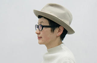
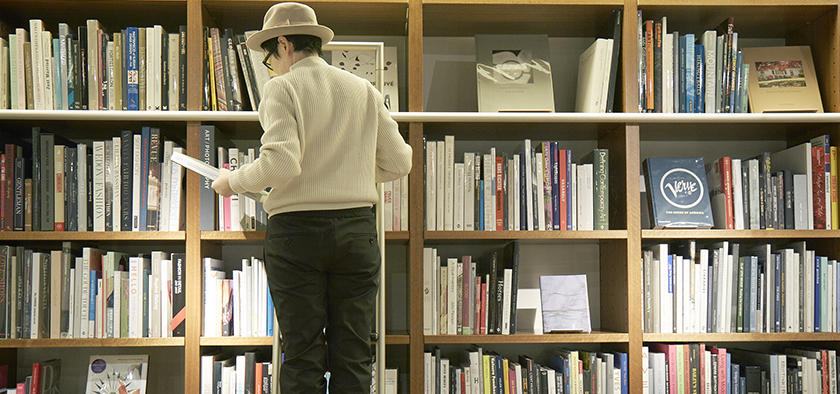
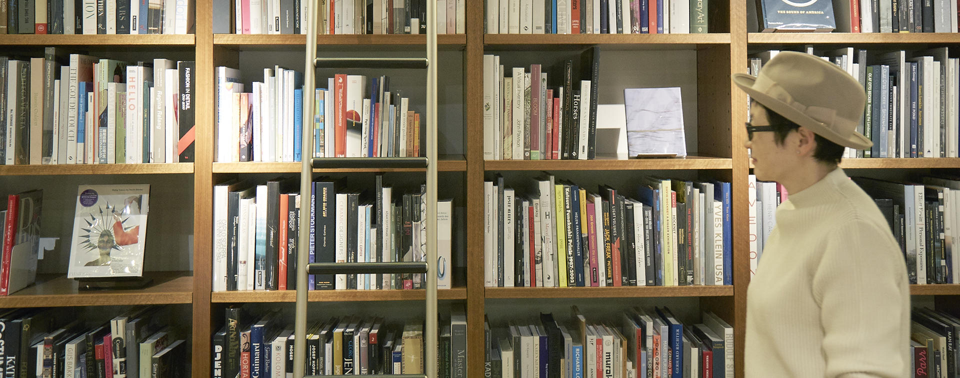
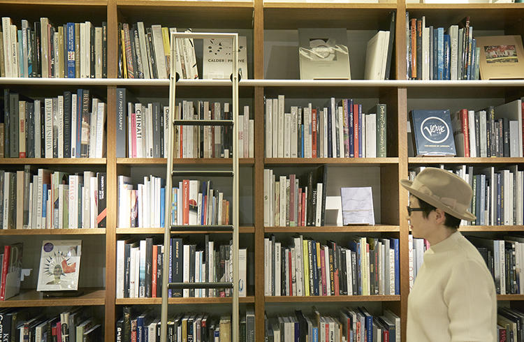
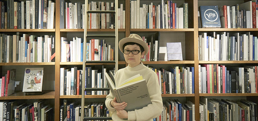
Naomi Hirabayashi works in a wide range of genres; she has been art director for Sonya Park's select shop ART&SCIENCE, the magazine GINZA, NTT Docomo, and more recently for la kagu, a commercial facility in Tokyo's Kagurazaka. She has also designed the packages for Japan Tobacco's "HOPE" cigarettes and the CD jackets for musicians such as Dreams Come True and Utada Hikaru. The photos for this article were taken at BIBLIOPHILE which is Hirabayashi's favorite bookshop. Hirabayashi told us that aside from going to work, she rarely leaves her house. Nonetheless she said there is a certain place she has recently become fascinated with.
My fascination with Berlin
I'm currently fascinated with Berlin in Germany. The city seems to have an element that cannot be found in either London or Paris. I went to Berlin many times this year. When something new is being built in an undeveloped area, it has a very interesting atmosphere - like New York's Soho in the old days. Berlin still has that atmosphere. There are shops that are not famous but individualistic, and there are people who are not well known but extremely nerdy with incredible knowledge in certain areas such as electricity. (laughs) I also think Berlin has an environment that is generally geared toward good living.
My fascination with Berlin might be due to my love of German designs. In Japan, you can get nice, standard things in the areas of clothing and food, but it's difficult to get hold of nice, standard utensils and parts and pieces for the home. People are very enthusiastic about interior decoration now and a lot of effort is being made in designs, but when it comes to the tiny, subtle details, most people seem to give up. So we have things like awfully designed light switches and weird-looking remote controls on the walls.
I can't stand those things, and so when I renovated my house, I spent an enormous amount of energy looking for each of the parts I wanted. For example, I wished to have the same tiles used in the New York subway, so I contacted a tile factory in Sri Lanka and asked to let me buy tiles from them. And I hated the large rounded gothic font for the words "zaitaku" (at home) printed on the SECOM machines, so I did some research and found that there were machines without the printed words made for foreigners. I feel that the knowledge I've gained through looking for things by myself helps me a great deal when thinking about design.
BIBLIOPHILE
A bookstore on the basement floor of the AXIS building run by the interior shop LIVING MOTIF. The bookshelves that line the whole wall hold around 2,000 books, mainly Western books on design, architecture and fashion.
The desire to design for public spaces
When I go to Berlin and other countries, I hardly ever search in the stores for products. Instead I visit the airports and city offices; I do research like finding out the type of toilet brushes being used. I go to public places because they are where many of the interesting designs are. This brings me to the topic of what designs are about. For me, designs are about things which are actually used by people and are part of everyday life. It's definitely not about things that are gorgeously lovely.
I find it difficult to describe the kind of designs that appeal to me. Some people use the expression "anonymous designs" but that doesn't seem to explain enough. (laughs) I like products which look so natural that we forget that there was a person who actually designed them. Those are the kind of things I wish to design.
In Japan, I like going to the Workman stores and home centers which sell functional, simple items that are inexpensive and durable. In such stores I might see a nail box with illustrations and minimum information like nail size, and it will give me a hint for my own designs.
Designs that can be understood at a glance
A long time ago, when I was employed at a company, I worked for about a year in London. Of course I had to pay taxes since I lived there. When the tax papers arrived, I was surprised to see that the format of the papers was of such clean design. Being tax papers, they were meant for all generations, young and old. Only one font and only one color were used, and only the places that needed to stand out were in bold or in italic. It was so simple but so proper.
In Japan though, if you were to get a printed notification on pensions for example, it would usually be in color, and in very big letters and it would be as if they wanted to get your attention on everything. And for some reason, the fonts are usually roundish, and there are nearly always illustrations of mascots. .. you get the feeling that they are making fun of adults.
The Japanese way of designing printed matter is something I discussed with Kaoru Kasai-san. I truly respect Kasai-san and wish he could be in charge of doing all the designs for the Tokyo Olympics. (laughs) Kasai-san told me that in Europe, they have timetables that can be understood at a glance; you don't need to know the language to comprehend them. He was saying that's how designs should be.

The properly designed systems in Europe
It's wonderful that in Europe they not only have products that look good, they also have properly designed systems. For example, items used by the German post office are yellow-colored and of excellent design, and the plastic boxes are reused by everyone in the town. People bring the boxes home, put things in them and take them to the post office again, returning them after they have finished using them. I really wanted one of those boxes and asked where I could buy them, and I was told that they are everywhere and don't need to be purchased. Reusing and circulating the boxes like that leads to less garbage.
I recently went to Berlin to take photographs. On my visit, I was impressed to see a project called "e-mobility Berlin" where people can use electric cars in the town, leaving them parked in the streets once they reach their destination. People can check their iPhones to see where the available cars are and how much fuel a car has. As in Japan, the automobile industry is an important industry in Germany, but young people are not buying cars. So the German government decided to support this project and that's how the system was set up. If we tried to do a similar thing here in Japan, I fear it would take 20 years or more to coordinate everyone's opinions. (laughs) And if the project does get started, there would probably be strange illustrations and logos on the boxes and cars...
e-mobility Berlin
A joint project for environmentally friendly electric cars which was started in Germany in 2008 by Daimler AG and energy company RWE AG. Daimler provided more than 100 electric-run cars including its Mercedes Benz and Smart cars. RWE set up roughly 500 charging stations and is in charge of operating them.
Public places and an art director's perspective
I'm always saying that I want to do designs for the United Nations or for banks and airlines; I want to design for public places and public things. The designs for Lufthansa are so sleek, aren't they? But Japanese designs inevitably tend to be of the "Pokemon jet" kind.
In Japan, public places such as stations and airports have terrible designs. It makes me sigh. I wish they would ask me to design for them, even if it were just the signs. Then at least I would space the characters properly. (laughs) In public areas, there is almost no art direction. Not that I think it's necessarily a good idea to ask a famous designer to do something: we might end up with simple, cool-looking designs which are superficial and not well-thought-out. It's not easy to solve this problem.
Content comes first, design comes last
The work of a designer comes at the final stage of a project. You need to have proper content before you start designing, otherwise it's meaningless. For example, it's not worth making a lovely poster for an exhibition if the exhibition itself is dull. Of course, it's not my place to express my opinions about the content of exhibitions, but if an exhibition seems interesting to me, I will voluntarily make proposals about presentation and public relations.
There are times when I can't help myself from speaking my mind; for example, when I was working for a clothing brand, I told them that they needed to have more products in order to reach their sales target. Before designing a nice catalog, the first thing I did was to think about what could be done to encourage people to buy the clothes.
This is a blunt thing to say, but it's essentially about figures, isn't it? We do business because we want to draw people and sell to them. It's no use having an appealing outer appearance unless you have proper content. You can't get results by relying on design alone.
I once designed a small fire extinguisher for a certain brand. The brand's original fire extinguisher had been a trendy item in white which wouldn't have been conspicuous in the kitchen. I felt that in the event of a fire, a fire-extinguisher has to be eye-catching. So I designed one in shiny red with just pictograms on the surface serving as instructions for use. Unfortunately, that there were too many regulations and it wasn't made into a commercial product.
Roppongi is not a place for aimless wandering
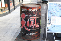
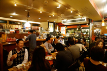
I'm a person who doesn't usually go out. I'm either at home or in the office and I don't go to Roppongi or any other place. (laughs) My office is in Minami Aoyama so I can walk here to Roppongi if I wanted to, but there are only two places in Roppongi that I care to visit. One is Tenho, a ramen shop I've always liked which is located in front of Tokyo Midtown. If I were asked by someone to recommend just one ramen shop, it would be Tenho. The other favorite place of mine is Shonzui, a bistro at the back of Tenho.
Tenho
A well-known ramen shop in Roppongi that opened in 1985. In front of the shop is a drum can that was originally used for making ramen soup. The main Tenho shop is in Sapporo's Ramen Yokocho. Naomi Hirabayashi recommends Tenho's famous soy sauce-flavored ramen called "1.3.5" which the shop describes as being "oily and salty with noodles that are firm to the bite."
Shonzui
A popular bistro located opposite Tokyo Midtown, one street behind Gaien Higashi-dori Street. Serves voluminous meat dishes such as steak from cattle raised in Tokachi Ikeda. "Not only do they have good wine and beef, they also serve delicious pork," said Hirabayashi.
As for memories of Roppongi, I remember coming here frequently as a child with my mother when she was going to her favorite fancy goods shop at Roi Building. In those days, there weren't many shops selling imported items, but this shop had Western things like wooden bags. I was also often taken to that legendary bar George's, as well as to an Italian restaurant whose name I've forgotten. But the places I used to go to tend to shut down for some reason. (laughs)
I like the atmosphere of the street in front of International Clinic in Iikura Katamachi. At the intersection, you can see the building of the clinic, the cars going by and the policeman who is always standing guard. Another nice place is Toriizaka where the International House of Japan is located. I also used to like the Tokyo American Club before it was renovated. The atmosphere of the club and the foreigners was not typically Roppongi, but subtly international.
The spots whose scenery I like remain here and there, but Roppongi today seems to be a place for two big commercial facilities - Roppongi Hills and Tokyo Midtown. I come by car to get here, but it's not a place where I would like to wander aimlessly.
Turning Roppongi more pedestrian friendly
It's no use trying to make people want to take a walk by doing something with designs though. As I said earlier, you can't rely on designs alone. It would be easy to redo all the road signs so that people will find it easier to walk. But it would be meaningless if the streets were not easy to walk in the first place.
It's difficult to change things by suddenly taking big steps so I think we should start with small steps. One idea would be to have a community bus like the "Chibus" (tiny bus) operated by Minato City. That bus is very convenient but it's of a very unnoticeable color. I think it should be redesigned to become more symbolic of the town. And maybe it should just be called "bus" and not "Chibus".
Handpicked products from Roppongi
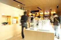
At the Tokyo Midtown DESIGN TOUCH event in 2011, I did a project called "Chanto tsukaeru design" (Functional designs) where I selected products from shops in Tokyo Midtown. Roppongi is said to be an area of design and art, but the designs that seem to be associated with Roppongi are slightly different from what I think of as being ideal designs. For example, when something like a household appliance is described as being of "Roppongi design" you would expect a distinct design. It seems as if there is some kind of pressure - a need - for things of "Roppongi design" to be clearly different. Do you see what I mean?
Chanto tsukaeru design (Functional designs)
A selection of approximately 30 products from the shops in Tokyo Midtown. From stationery and toys to underwear and wine, Hirabayashi chose items which she personally felt were interesting, nice to look at, and pleasurable to use.
But in this project, I handpicked products that were in line with my values. I selected items that were properly designed and easy to use but were not full-blown expressions of the designers. The items were easy to use, and were of functional design - just like the title of the project - and they could be used daily.
I don't usually come to Roppongi to buy things, but it was fun selecting the items. The selection was limited to products sold in Tokyo Midtown, but I'm sure it would be interesting to select products from other places such as AXIS or Roppongi Hills. The selection I made was like the Roppongi version of Design Selection - a select shop on the upper floor of the Matsuya Ginza department store. It would be good if all the handpicked products from Roppongi could be gathered together, and there was a place or a system for people to buy them.
Editor's thoughts
I agree with Hirabayashi-san that there is charm in products whose designs are not too individualistic. Some products look so natural that they do not even make the user conscious of the fact that they have been designed. I am sure that many of us would welcome a hardware store selling products from around the world that have been selected by the discerning eye of Hirabayashi-san.(Editor Kentaro Inoue)
The article was partly touched up on April 8, 2016.


