INTERVIEW
140
Takuya OnukiDesigner / Art Director
We Need Design that Functions in Society More than Ever
Design has great power to change the future, which comes with great responsibility
Takuya Onuki is a designer and art director who is one of those rare individuals where modifiers such as “Japan’s preeminent” and “the legendary” don’t seem frivolous. He has created numerous advertising masterpieces such as Nissin Cup Noodle’s “hungry?” Pepsi’s “Pepsiman,” Shiseido’s TSUBAKI hair care products, Shinchosha Publishing ’s “Yonda?” and Toshimaen amusement park’s “Our Pool’s Nice and Chilled” ads that are still engrained in many people’s memories. Onuki’s ideas are so astonishing it’s like a jolt through the brain—one that surprises at first and then seeps in as if it had always been there. He is the very definition of “genius.” In an intensive interview, we asked him primarily about the thought and production process that went into his HIROSHIMA APPEALS 2021 poster for which he received the Yusaku Kamekura Design Award , in addition to his insight into the current creative marketing scene and what designers can do today.
I tackled the poster design thinking there was significance in having someone like me work on it
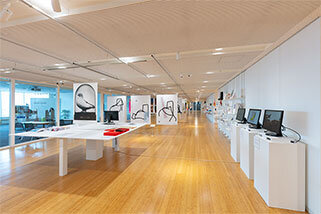
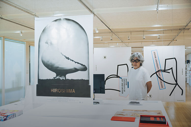
My HIROSHIMA APPEALS poster design appeared in the Graphic Design in Japan 2022 exhibition held at the Tokyo Midtown Design Hub . Every year, one member from the Japan Graphic Designers Association (JAGDA) creates a new poster for HIROSHIMA APPEALS. In all honesty, when I was asked to do it I thought, "Wow, this is a major responsibility," because I was acutely aware of just how heavy the subject matter is.
Graphic Design in Japan 2022
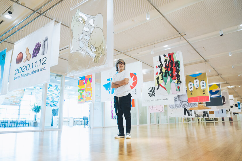
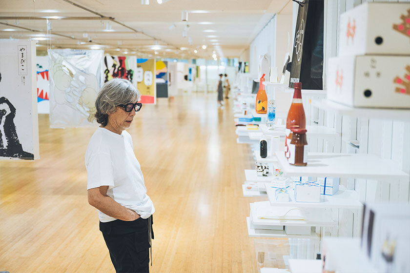
The Japan Graphic Designers Association (JAGDA), the biggest organization of graphic designers in Asia with roughly 3,000 members, publishes an annual collection of outstanding works by members from the previous year entitled Graphic Design in Japan. About 300 works from the 2022 issue were shown in an exhibition at the Tokyo Midtown Design Hub, including Onuki's HIROSHMA APPEALS 2021. (June 30-August 11, 2022)
HIROSHIMA APPEALS
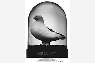
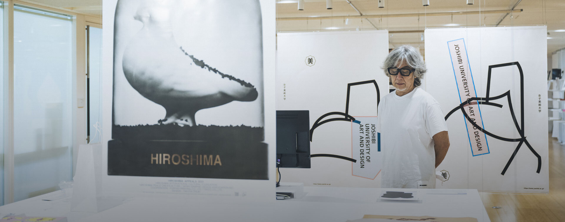
The Hiroshima Appeals is a poster campaign launched in 1983 that aims to transcend words and widely convey the "Hiroshima spirit." A different designer is put in charge of creating a new poster every year. Yusaku Kamekura designed the poster for the very first year. Onuki was in charge in 2021, for which he produced a poster with a white dove sitting inside of a snow globe. The use of augmented reality (AR) allows viewers to see a video of black powder swirling around in the globe. The work was on display in Onuki's solo exhibition HIROSHIMA at Creation Gallery G8. The HIROSHIMA APPEALS 2021 poster is available for sale at the JAGDA office in the Tokyo Midtown Design Hub (B1 size: 1,100 yen tax included).
Also, there's a past poster by Kaoru Kasai that's just outstanding. I remember thinking, "anyone who has to follow this is going to have a tough time," but I never imagined I would be one of those people.
I led an adolescence that was the very picture of what they call "complacent about peace." As a designer, I frantically chased after whatever seemed interesting or new. Given that, did I really have any right to be involved in HIROSHIMA APPEALS? I wasn't sure, but I did think that perhaps there was significance in having someone like me tackle the issue.
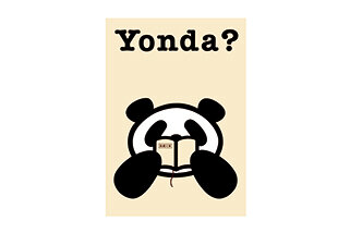
That was when I was reminded of the time I took on Shinchosha Publishing's "Yonda?" campaign job. At the time, I was not the kind of person who regularly read books. That didn't seem like a good fit for working on a campaign to boost small bunkobon-format paperback sales. But then I thought, perhaps I was an appropriate choice after all, precisely because I understood the feelings of people who don't read books. It was the same with the HIROSHIMA APPEALS poster. I took it on because I thought there was significance in having someone like me work on it.
Yonda?
In a campaign for Shinchosha Publishing to boost bunkobon paperback sales, Onuki handled the design of the iconic "Yonda?" panda character, as well as original Yonda CLUB goods given out as prizes according to the number of points collected from tags in each bunkobon, and related marketing.
Fixated on conveying a sense of immediacy
Thinking back, it was perhaps the biggest job of my career in the sense that the theme and objective of HIROSHIMA APPEALS is so colossal. I had to contemplate war and the atomic bomb, which are such fundamental matters for humankind and some of the most complex issues that exist in society, so it took me a long time to feel mentally prepared. I needed the time to get to know about Hiroshima in my own way and sort through my emotions. At the end of it, I knew I had to tackle it with a solid idea of what I personally thought about the issue, no matter how anyone else might react. That's how I decided to face it in the end.
I had a big assortment of ideas in my mind, but I had never been so perplexed over which idea to go with. I definitely wanted to avoid doing anything that might seem like it came out of a design challenge that judges expression based on wit or novelty . I wanted to leave an impression so intense that it would be like holding a knife up to the throat of younger generations, and the one thing I was really fixated on was giving it a sense of immediacy. I wanted to make it feel immediate in way that would move viewers' souls and make them contemplate war and the atomic bomb as relevant concerns. I felt that if I didn't make something that was sure to leave a mark in people's minds, I would have failed.
The surprising white dove. The resulting sight made my heart wince.
My initial idea was to put the Atomic Bomb Dome in the snow globe. I hadn't intended to put in a white dove at all. I thought the white dove was too much of a cliché as a symbol of peace and would come across as superficial. When I initially made a rough sketch in Photoshop, seeing the symbolic white dove get engulfed in black powder was a lot more shocking than I thought it would be. But when I looked at the same rough sketch again the next day, it wasn't striking at all anymore. I thought, "Huh? It doesn't make me feel anything today." I thought about why that was, and realized that I had completely been in a "Hiroshima mindset" at first because I had spent so long thinking about the atomic bomb and Hiroshima. That's why I couldn't relate to the poster when I suddenly came across it in the midst of everyday life.
Partly because of that I initially scrapped the dove idea, but then thought, "Hold on, considering how shocking it was at first, I could at least try making a mockup." I bought a snow globe kit and put in a white clay dove and some black powder to make a prototype. Then I tried shaking the snow globe and it was like, "Whoa, it's way too intense I can't even look at it!" It was an even bigger shock than the rough sketch. That convinced me that this was the way to communicate with the sense of immediacy I was looking for.
I knew that the job I was given was to create a poster, but wasn't this snow globe the answer I was looking for? I ultimately wanted to make it a staple Hiroshima souvenir. I felt like I finally had a clear answer. This meant the poster would be meaningless unless it also moved. That's when I decided to incorporate AR technology.
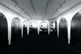
HIROSHIMA
This special solo exhibition was held at Creation Gallery G8 in commemoration of Onuki's HIROSHIMA APPEALS poster design and related work receiving the 24th Yusaku Kamekura Design Award. Asides from the poster and actual snow globe, the exhibition included new posters and an installation featuring the awarded poster design. The floor of the venue was carpeted with black powder, and Onuki had this to say about it: "I wanted visitors to completely shift their mindsets the moment they entered the venue. I changed the very floor underfoot to allow them to get mentally prepared to see what was in the exhibition."

Praying for peace in an era with an ominous air about it
The poster itself shows the dove in its entirety, but when you hold a smartphone up to the poster the video rewinds like a time machine and black powder engulfs the white dove. At first glance, it's as if time has been wound back from a peaceful picture to the day of the atomic bombing. Actually, the first draft of the poster had been a more devastating visual of the white dove covered in loads of black powder. The idea was for that image to start moving in AR and reveal the entirety of the white dove in the very last cut. But something felt off and after continued trial and error, I ultimately realized that the last cut of the white dove surprisingly had the most impact.
I think it's the atmosphere of the current times that made me feel that way. Russia hadn't invaded the Ukraine yet during the production process but there seemed to be a kind of ominous air brewing all over the world. I didn't want a world where posters of white doves symbolizing peace had to be put up all over cities, where the younger generations had to live through an era like that. When I imagined that possibility, the visual of the white dove no longer felt unremarkable or clichéd, and instead started looking incredibly ominous. At the end of the AR video the white dove appears again and gives a sense of hope, but the dove is still within the glass. It's waiting for peace so that it can be free to fly.
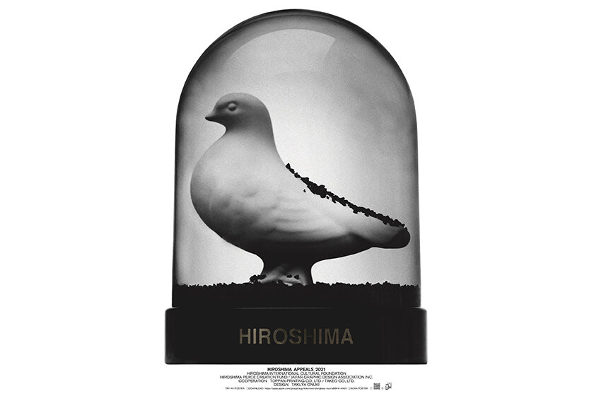
You can watch the AR version by downloading the special app (aug!) and holding the phone up to poster to view it through the app (for a limited time only).
Is there anything I can do for society? Reconfirming a long-held value.
Through this job, I received the 24th Yusaku Kamekura Design Award. When I was a child, one of my first encounters with graphic design were the Tokyo Olympics posters by Mr. Kamekura. I still have a clear memory of that moment, when I thought, "I've just encountered something amazing that I've never seen before." To commemorate the award, I was given the opportunity to do the solo exhibition HIROSHIMA at Creation Gallery G8. It featured an installation of photos and videos of various moments of the black powder swirling up in the globe.
Having worked in advertising for a long time, I came to question ads that solely exist to force product sales and always thought there must be something more they could do for society. Nowadays, it's not unusual for people to talk about "the good of society" but at the time people sometimes looked at you weird if you said something like that. I feel that through HIROSHIMA APPEALS, I was able to reconfirm this value that I have upheld over the years. Considering that I have always worked with a sense of pride in being particular about communication, of getting the message across properly, and getting results, I hope that this poster will serve to function in society as much as possible.
Values that contradict common sense are what move people
HIROSHIMA APPEALS is not the type of endeavor that can be measured by good or bad, or right or wrong. I think the value lies in getting the message out there. In contrast, advertising is by definition a means for selling products, so ads actually can be good or bad, or right or wrong.
Back in the day, "new" was the pinnacle of value. I feel like we were engaged in a perpetual competition to come up with new things, saying stuff like, "They thought of it first!" and "This is so frustrating!" In order to be competitive we learned how to question convention and produced ideas by proposing new values that contradicted common sense.
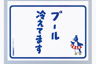
Toshimaen "Our Pool's Nice and Chilled"
Onuki created a poster for the Toshimaen amusement park pool in 1986. The tagline, which is a parody of the "Our beer's nice and chilled" signs that pop up everywhere in the summer, is accompanied by a cute penguin character. The poster served to communicate the straightforward appeal of the pool, thus fulfilling the advertisement's most fundamental function.
In areas such as contemporary art, "new" still has great value even today, but the worlds of advertisement and design have changed quite a bit. In the past, only specialized professionals from ad agencies and those with the word "creator" in their title were allowed to plan advertisements. But now the door is open to all and anyone can be a part of the creative process. That may seem like a really good thing, but because everyone is allowed to provide input, I'm concerned that things are too broadly agreeable and hinder the potential for innovation. With no one to take on the responsibility of leadership, instead of innovation all I see are products of excuses that strive to be "right." I also think there's more of a sense of individualism nowadays, where people don't care as long as they personally don't lose out. Unsurprisingly, the current trend of avoiding risk is boring. So of course content you see these days lack energy, and creative marketing is no match up against youthful social media communication or the influential value of celebrities.
New values are what make the most powerful ads
Current marketing considers it more efficient to simply copy good ads if they will succeed business-wise. As such, whether something is new or not is unfortunately becoming even less important. In addition, ever since computers became central to graphic design, a wider group of people have been able to partake in design. The result is a flood of designs that follow the same replicated templates, and you can see the same kind of seemingly-stylish designs all over the country. Products that once seemed lackluster started selling after giving the packaging a stylish makeover. People realized the obvious truth that product design has more of a sway on tempting buyers than a poorly functioning advertisement. But while focusing on product design was great, unfortunately that manifested in a superficial way. The seemingly new packaging only creates a momentary illusion of success that doesn't last long. Well, I figure this particular design fad will last maybe five years before ceasing to function anymore.
The field of design is most definitely expanding and with it the potential of design as well. Fundamentally, new values are what make the most powerful ads and content. I really wish that there was more of a desire to compete with new ideas, both in creative marketing and design.
A good idea can't succeed without suitable capability for output
These days, people are more fixated on discussing method and presentation in both design and advertising. In other words, it seems like it's all talk. When I was young, most designers didn't talk. I do think it's good that design can now be put into words, but on the other hand designers today have ideas that are conceptually impressive but can't seem to nail the final landing. If they could, I figure businesses everywhere would be succeeding right now. I think lots of new ideas are out there in the world. However, for a new idea to succeed it inevitably needs some new form of expression that can make the idea leap.
Design is anything but powerless. It's incredibly influential.
I believe that advertising and design work has a lot of influence. Take the HIROSHIMA APPEALS poster for example. You'd think that one person can't possibly have the power to do anything about war, right? A single person has no influence no matter what they might do. The current tendency is to sound astute by saying that kind of thing. Of course, a part of me does think that way. But if I quit, nothing would ever come of it. Even if it's just one single poster, if it stirs some kind of emotion in some boy who witnesses it, that's enough to say it has an impact. Anything and everything starts from a single point somewhere. I maintain that it's not right to give up just because you assume you can't do anything.
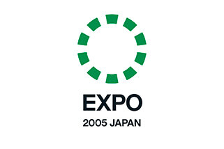
When I did work for the 2005 World Expo in Aichi , I had the experience of getting shivers from the idea that I envisioned. The moon rock that was displayed at the Osaka Expo in 1970 became a sensation of the times. When I pondered over what the main draw should be for the new expo, I came up with the idea to make the nature in front of us the star of the show. If nature became all the rage in Japan, so many things would change from the way children are raised to beyond, ultimately changing the whole of Japan. I got goosebumps in that moment, as I realized that my own idea had the potential to change the future.
The 2005 World Expo, Aichi, Japan
The first world expo of the 21st century held in Aichi Prefecture from March 25-September 25, 2005. More than 120 nations participated, which was a record number in Japan world expo history. The main theme was "nature's wisdom." Onuki participated in the planning of the expo and designed the symbol mark for the event..
So I believe that there is great responsibility in sending messages out to the world. Maybe that sounds too serious. [laughs] But it's true. Limiting yourself to individualistic pursuits only leads to financial gain, but when you turn your thoughts toward the future, design has the power to bring about change.
Designers should fulfill their responsibility of communicating using visual means
I think what we as creative professionals can do for society lies in the importance of presenting ideas "more visually." At the end, people need visual cues to be able to imagine something. For example, people who grew up watching classic children's anime about families like Sazae-san and Chibi Maruko-chan can envision what a happy family looks like. But if that kind of content were to someday disappear, I think there will be people who can't picture what an idyllic family looks like. People are regulated by visual information much more than you would think.
Perhaps sights that we take for granted now will disappear someday if we let them, and by the time we realize it nothing may remain. That's another possibility that alarms me. As I mentioned earlier, you can plan something "interesting" based on abstract thinking or conceptual notions and call it "a good idea," but in the end you can't get results without suitable output. I'm worried that the overflow of ideas and designs that follow the same replicated templates have made people lose sight of everything. That's precisely why I think it's necessary for designers to fulfill their obvious responsibility of communicating properly using visual means.
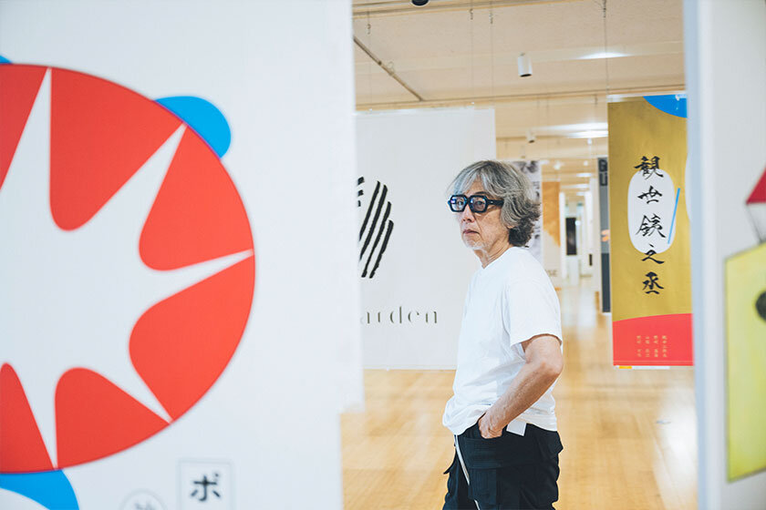
Photo location: Graphic Design in Japan 2022 (Venue: Tokyo Midtown Design Hub; Dates: June 30-August 11, 2022)
Editor's thoughts
The interview started with Onuki-san laughingly saying, "I always talk too much, so I told myself before coming here today that I wasn't going to talk." Nonetheless, he answered all of the things we wanted to ask very thoughtfully and passionately, occasionally interjecting interesting tidbits here and there. It made us think about how important it is to be like Onuki-san when trying to break through the status quo--by being exhaustively thorough when contemplating ideas, by dynamically overturning common sense, and by making sure your message gets through to people's hearts. The creative process may be a struggle, but it's clear from his words that working in advertising and design is fascinating. His attitude was contagious, and the interview was just as fun and passion-filled for us. (text_akiko miyaura)
RANKING
ALL
CATEGORY


