INTERVIEW
123
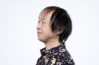
Shin SobueDesigner
Creating a "Meaningless" Space where Art Can Develop without Direct Economic Significance
Mutual communication, interaction, and pursuing the joy of "things not working out"
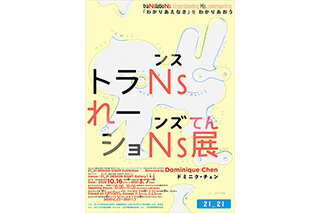
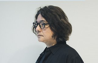
Shin Sobue is a designer at the forefront of book design, delivering astonishing novel and comic book designs that defy convention, including the notable special edition of Natsume Soseki's Kokoro. His talents extend into art direction for exhibitions, and he has received attention for his graphic design work for the current 21_21 DESIGN SIGHT exhibition traNslatioNs — Understanding Misunderstanding. Often hailed as a "genius," we zeroed in on his ideas on the appeal of "misunderstanding" and the joy of "things not working out" to examine the essence of the role of design in bridging communication.
There's no possible way to accurately understand something
The theme of the current 21_21 DESIGN SIGHT exhibition traNslatioNs — Understanding Misunderstanding is "understanding and embracing mutual incomprehension." Personally, I find that the most incomprehensible thing is my own self. Perhaps I'm able to be who I am precisely because I don't understand, so that's okay. It's okay not to understand. The very effort of trying to understand is a beautiful thing, and living with "the me I don't understand" makes things fun. I don't think it's right to ignore or refuse to think about something just because you don't understand it.
traNslatioNs — Understanding Misunderstanding
Based on Exhibition Director Dominique's Chen's idea that "translation is designing communication," the exhibition puts a spotlight on various forms of translation that serve as bridges to transmit and receive communication, such as through visual sensations, auditory sensations, or bodily expressions. Shin Sobue is in charge of designing the main visuals and pamphlet for the exhibition, which is scheduled to run through Sunday, March 7, 2021.
Meanwhile, I feel like I understand other people somewhat better because they aren't me, but that's just a feeling. It's impossible to truly understand in the first place. There's no possible way to accurately understand something. But people nowadays hate that feeling of not understanding. The anxiety of not understanding —of not knowing— is so great that they can't help but put their guards up. That's not very pretty.
During the post-war economic boom, everyone had fabulously high hopes for things they didn't really understand. They thought that anything unknown must be something really great. Whether or not you include the craze over mythical creatures like the tsuchinoko (a snake-like cryptid) or communicating with aliens, people back then found joy in things they had never seen before. But lately, the unknown and the incomprehensible have become sources of fear — things that cause aversion and anxiety. Society and the economy operate based on that kind of anxiety. I suppose that's why in the current coronavirus pandemic, people are already used to living in a society with anxiety — driven businesses like insurance and security systems. But to tell you the truth, I find myself wishing that society could make people more excited about things yet to be seen and yet to appear.
Not understanding one another leads to fulfillment
Nowadays, if you ask students what they want to do when they grow up, you can't expect energetic responses about the things they want to be. They just answer, "I don't care as long as I'm alive and doing okay." They live in perpetual defense-mode, which I think is such a waste of a perfectly good life. It's understandable given how incredibly uncertain things are, but is striving to live in safety really worth it? I mean, society is always on the move. So instead of struggling to ensure security, I think it's more important to think about how to find fulfillment in things that aren't safe.
I personally think it's better not to be too scared of uncertainty. Danger is always lurking everywhere, so anything can be uncertain. The goal is to figure out how to enjoy living with uncertainty and to build a good relationship with it. Why not just accept it for what it is in the first place? Accepting that things are incomprehensible and that you can't understand how other people think lead to a more fulfilling world that doesn't fall into arguments over which side is right. In other words, not being able to understand one another leads to fulfillment.
That would also eliminate the need for enemies and allies. Back in the old days, samurai and superhero shows always had the good guys and the bad guys, and watching battles between good and evil was immensely popular. But those battles seem awfully dull now, and that's not what people want to see. I get this impression from seeing how storytelling has changed in shows like the Kamen Rider TV series, where recent plots involve the protagonist's closest friend turning out to be the rival or enemy, and the story hinges on whether they can resolve their issues. I feel like we're nearing an age where those who would have been labeled as heroes and villains in the past can go grab a coffee together.

Design is not honyaku
When I was first approached concerning this exhibition, it was simply called "the honyaku exhibition. "To be honest, I wasn't sure about using honyaku (the Japanese word for written translation) as a theme and didn't really care for the idea. This was particularly because I sometimes hear people say "design is honyaku," and there are a lot of designers who think that design is about converting an idea into something that communicates that idea effectively to the target audience. But design isn't the same as honyaku, and I don't think it can be defined as a conversion device like those people think.
Of course, some designs are required to communicate something. But I think more than effectively communicating or expressing an idea, it's important for a design to express the joy and fulfillment of mutual communication and interaction.
In contrast, my general impression of the word "honyaku" inevitably feels one-sided, where words are converted from one language to another. I thought simply showcasing that kind of technique of communication wouldn't be very interesting at all, but then I was told that the theme was actually the English "translation" instead of the Japanese concept of "honyaku." Exhibition Director Dominique Chen told me that the word "translation" actually includes the idea of "bridging" between people, and I was sold. Bridging implies that the theme is no longer about whether the communication is successful or not, and more about the fun that happens when attempting to communicate. That sense of fun is key.
Things that regularly exist in everyday life are quick to disappear from memory. They become invisible. You become desensitized, like how staring at one thing for long enough makes it blend into its surroundings. But the desire to communicate is what reminds us of the things that have blended into everyday life, and I believe design is about creating an entryway, or a "door," to access those things.
The joy of things not working out
Furthermore, my overarching theme for design is "the joy of things not working out." Of course, success is a very important thing that offers a sense of accomplishment. But it's more of a competitive, athletic sense of accomplishment, or joy that comes from a comparative feeling of superiority. If anything, I think there's nothing more boring than things working out successfully, because living life means enjoying trying to balance uncertainty.
There are little snags in everything, right? For example, in Japanese calligraphy, the "poor relationship" between brush and paper is what makes for good work. If the brush runs too smoothly, the results are unremarkable. The finished characters may certainly look neat but they'll be completely devoid of character, like an example in a handwriting workbook. The brush snagging on the paper produces good results, be it in writing or otherwise. Embracing and enjoying those little snags head-on results in moments where you feel like you have created something worthwhile, or a good relationship between brush and paper.
Design is a "snag" for creating good relationships that spark joy in people. Actually, it's not necessary to know whether the relationships are good or not, so instead of getting caught up in semantics, I think the really important thing is to think about how to produce an object or a situation that creates joy. And in the respective relationships, no one side is more important. I like situations where the principle and the auxiliary keep interchanging as naturally as breathing in and out.
It's interesting to keep separate things the way they are
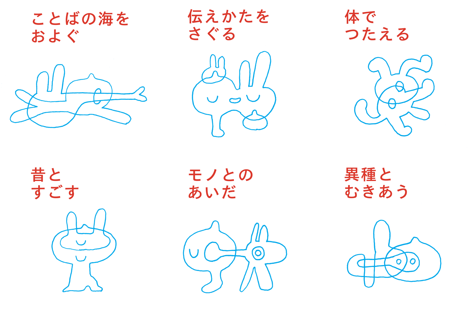
I also made the signs for the traNslatioNs exhibition. Signs exist to communicate information, so usually they shouldn't be difficult to understand. But I thought for this exhibition, it might make sense to design the signs as "pictograms of misunderstanding."
traNslatioNs exhibition pictograms
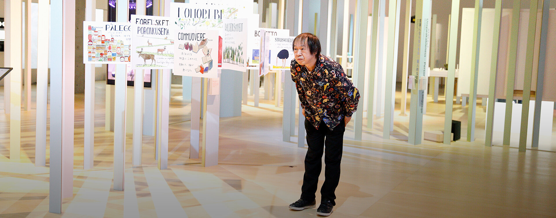
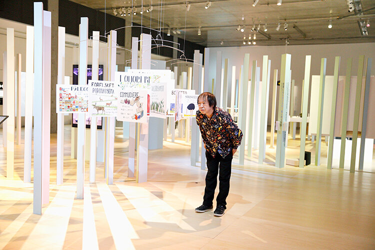
Sobue provided hand-drawn signs depicting the themes for each exhibition section. The pictograms are designed to vary stylistically and give different impressions depending on the relationship between the two characters.
I first came up with the idea to make signs because there were so many pieces to show, and without a structural framework I thought people might not remember what they saw and have difficulty searching for what they were looking for. Creating a storyline with "chapters" to follow facilitated visitor interaction with the work in the exhibition. It's basically a lubricant of sorts. I deliberated with Exhibition Director Dominique Chen and Planning Associate Arina Tsukada and had them come up with "word clusters" to act as that kind of lubricant. Instead of words that fix things in place, we decided we wanted to keep them fluid, and they came up with wonderful phrases such as "Search for Ways of Conveying" and "Swim in the Ocean of Languages." It's ambiguous whether the pictograms express that fluidity or not, each with a kewpie doll and a bunny in various relative configurations: sometimes stuck together, sometimes protruding into one another. They're pictograms of nonchalant misunderstanding.
There are all kinds of works displayed in the exhibition venue, and each of them may have been developed to accurately communicate something. But I believe that ultimately, the more important thing is what results from a potential design of misunderstanding in how the works relate to one another, such as joyful spaces or enjoyable times, and that defines my involvement with this exhibition. I want to believe that, in life, it's important for differing things to interact in fulfilling ways without changing the way they are.
Taking things that seem removed from design and presenting them as design
One other thought that came to mind with this exhibition was that I didn't want to be involved from the perspective of "teaching design." I wanted to take things that seem removed from design and present them as design for the kinds of people who think, "I don't really care much for design" or "What the heck is that? I don't understand." That's why I drew those pictograms in wobbly freehand. Maybe I shouldn't be the one saying this, but you can't even pretend that they're good drawings (laughs). They're certainly not good. But you can't say they're bad, either. They do spark a bit of something, right? I was very nervous whether they would be approved when I showed them to 21_21 DESIGN SIGHT Director Taku Satoh, but then he said, "They look good!" which was a relief.
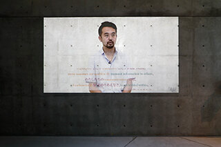
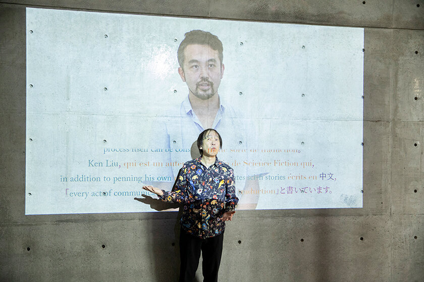
I'm always very impressed with what goes on at 21_21 DESIGN SIGHT. Part of what 21_21 does is design education, which is a difficult subject because it has the danger of getting too preachy. But 21_21 has always tried different things to avoid that. This exhibition starts off with a video welcome from Dominique-san, and I love that it's already good for a laugh from the get-go. You should watch it to know what I mean, but it's great that you can get a laugh out of thinking, "Dominique-san, I don't really get what you're trying to say!" Whatever the theme may be, it's always a good idea not to make things too grave.
TRANS-PORT
Includes a video director's message in multiple languages by Exhibition Director Dominique Chen.
But really, there's nothing more important than understanding misunderstanding. "Understanding one another" isn't about converting someone else to accommodate you or society's needs. You can live alongside each other in comfort, even if one side isn't in good condition. There are all kinds of people, but instead of forcing everyone to be the same, you can pursue the fulfillment of everyone coexisting with their differences. I think the traNslatioNs exhibition provides hints for living that way.
A quarter with places to hide on the backstreets
What catches my attention when walking through a district is the flow of people moving about. Although I'm a designer, I have no interest in billboard designs or anything like that. Whenever I visit a new area, I'm really interested in the way people move there. Why? Because if you observe how people move, you can tell where you can covertly smoke a cigarette...which is a comment that will probably get me in trouble, so putting that aside, I'm interested in the backstreets away from the main roads and what they are like. How interesting a quarter changes depending on whether or not its backstreets have little "hiding spots" that don't come with the danger of criminal activity.
I used to live in Roppongi about twenty years ago, and that area in particular changes so rapidly, even by Tokyo standards. The speed was such that what would take 100 years in another district would happen in the space of about ten years. Change itself is fine, but personally, I wish that they wouldn't make everything completely transparent, and leave spots where weak people and people being bullied can hide from constant monitoring. Another thing is that cities are generally designed with people in mind, but I can't help but wonder how creatures other than humans are living in Roppongi. Like frogs. I'm a real lover of frogs. Frogs are my friends.
Disticts need "meaningless spaces." That's something I would want to preserve. Parks are meaningless spaces in a way, and perhaps the fact that a space is meaningless gives it meaning in itself. But I think it's important to have spaces that don't have clearly defined uses that just exist for no particular reason. I want to see facilities or buildings with relatively unspecific purposes.
A meaningless space where art can develop without direct economic significance
But...you can't ignore that fact that real estate in Roppongi is expensive. Because land is so expensive, it's hard to justify things that don't have direct economic merit. Even if I wanted to create a "meaningless space" with no purpose, people would say it's a waste of land. It's the same with art. The more urban a place is, the more capitalistic its art becomes. The majority of the art inevitably becomes "lucrative art" planned with money in mind, such as character stuff and pop art. But looking at global trends, there has gradually been more recent interest in art dissociated from money. Also, social media and other technology means being in Tokyo won't be such a crucial thing in future society. Given that, I hope that things will change and more emphasis will be placed on creating meaningless spaces where art can develop without direct economic significance.
You could argue that meaningless space is unnecessary space, but in a way 21_21 DESIGN SIGHT is unnecessary too, right? It doesn't have much direct economic significance, either (laughs). It's wonderful. I want there to be more places like this that can operate without really making a profit. Love and art have always had indisputable appeal, and labeling something as "art" or "love" was enough to validate it regardless of content. Sadly, even though people are more aware of design as a genre, they are not as unquestioning about design, so calling something "design" only earns a flippant "so what?"
As seen with the issue over the Olympics logo, the fact that so many people are monitoring design is good in that it is attracting interest, but misunderstanding is still far too rampant. Like the misunderstanding —or misconception— that a design chosen by majority vote is good design. Going back to what I was saying before, design doesn't exist to explain. A design should perhaps remind you of something you have forgotten, or prompt you to properly reexamine something that has become part of the scenery. It's better for a design not to be so readily understandable.
Editor's thoughts
In a phrase, my impression of Mr. Sobue during the interview was "an animated rock 'n roller." He danced his way in, and despite nursing his shoulder saying, "I'm in my sixties now, and I still have frozen shoulder syndrome from my forties," he nevertheless danced his way out after the interview. He lit up the room with a fun atmosphere, but his words were filled with a gentle love for design and his serious thoughts on the subject. It was almost like a lecture on philosophy that I want to listen to and muse over again and again. At some point, he said, "Everyone has the experience of feeling a wind blowing from right to left through the body, right?" According to Mr. Sobue, that's the state of being excited and the effect design can have. It was a fun interview! (text_tami okano)
RANKING
ALL
CATEGORY


