INTERVIEW
109
SPREADCreative Unit
The Cultural Contrasts Make Tokyo Attractive
New scenery revealed by the continuation
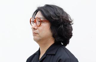
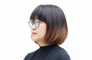
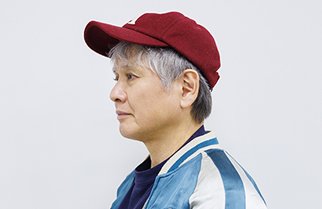
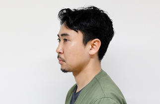
Hirokazu Kobayashi and Haruna Yamada are the creative team designers from SPREAD. They made their unit name known for "Life Stripe," which translates activity patters of a day using bands of colors, and the exhibit work at Milan Design Week, which uses colorful tapes to create an interesting space. Worthy of the name, SPREAD, the team utilizes the intuitive beauty to spread imaginations. We invited them to talk about behind-the-scene episodes of Roppongi Color Canyon at Tokyo Midtown DESIGN TOUCH 2019 (October 18, Fri. through November 4, Mon/ National Holiday) and learn insights of the hidden capacities of the colors and designs.
We look at contrasts, not colors
KobayashiIt doesn't matter if we work in Japan or outside of Japan, but we always go to the venue and look at it first. When I say "look," it means many things like standing there in a daze or studying the history of the land. But our purpose of "looking" is to try to understand and collaborate with the venue. A year ago, during the fall foliage season, when we were presented with the proposal to exhibit at Tokyo Midtown DESIGN TOUCH 2019, streets were covered by vibrant colors of leaves. I remember us talking about how exhilarating it was. We realized that fluttering cherry blossom petals and post-typhoon atmosphere elicit the same sensation in us. That very sensation led us to the idea of "creating a terrain."
Tokyo Midtown DESIGN TOUCH
Tokyo Midtown DESIGN TOUCH is an art design event, which started in 2007 under the concept "to enjoy designs though all five senses." Leading domestic and international designers, as well as trending designs, are invited to Tokyo Midtown. This year, the event theme is "Fusion" as the fusion of designs, scenery, science, and activities seek out to create new values. The event is held from Friday, October 18, 2019, through Mon (Holiday), November 4, 2019.
We sometimes gaze absently at the green colors of woods and blue colors of the ocean, for example. To make a long story short, I realized one day what we look at are not colors. This leads to a new question: what is it that we are looking? We actually look at the infinite contrasts in the depth of colors.
When the wind blows at sea, it creates contrasts as some areas shine, and the others cast shade. The movements caused by marine organisms and creatures, as well as ship traffic, form different layers of contrasts, which create the color of the sea. All these elements behind the colors are what move me emotionally. Colors printed on paper, mainly on matte paper, have the same effect on me as the colors of nature. The surface of enlarged matte paper is embossed, and its texture creates tiny highlights and shadows. I noticed that for the first time fifteen years ago when I visited South Africa. The considerably stronger sun and lower humidity in South Africa made the sunlight very intense. I was made aware of how beautiful contrasts are through the sensation on my skin, not through the perception in my head.
YamadaIt was more like we persuaded ourselves to think that.
KobayashiThe experience in South Africa was just an eye-opener. It still took about another five years before I realized the colors of the sea and forests. Understanding the roles of contrasts layered beneath different colors, we have dedicated ourselves to pursue the color combinations that vividly trigger our memories for the last fifteen years. We merged our pursuit of color combinations and the concept of "DESIGN TOUCH" to create our work of Roppongi Color Canyon.
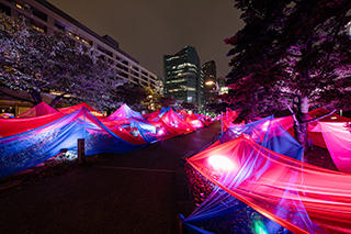
Roppongi Color Canyon
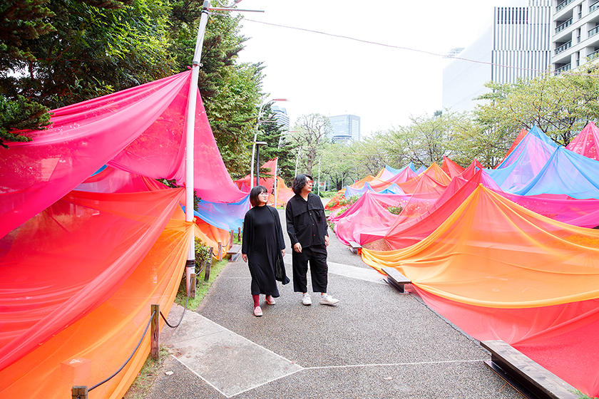
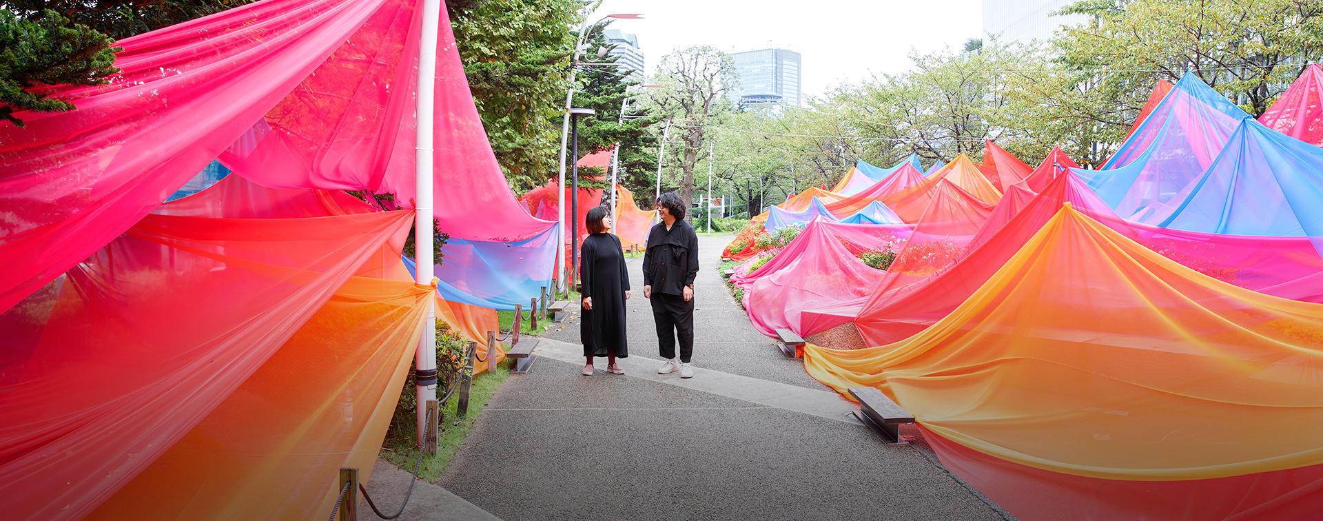
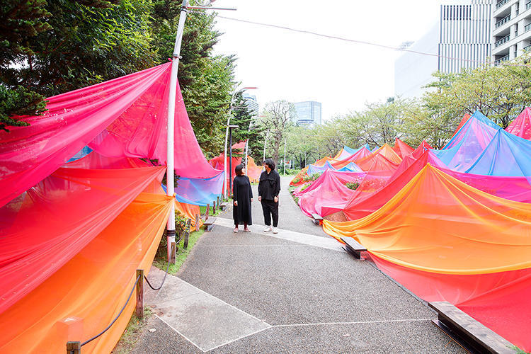
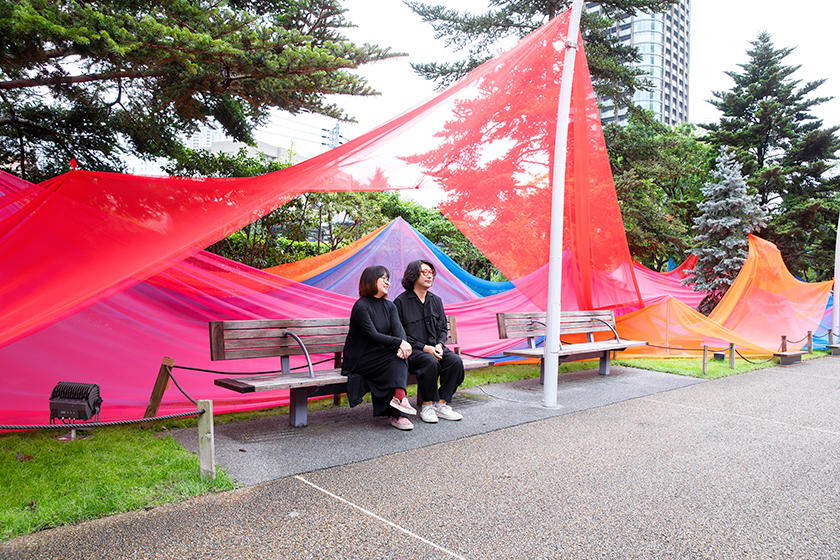
This 80-meter installation across the Midtown Garden aims to immerse visitors in color scenery. The Midtown Garden's landscape design was inspired by the transitions of nature and landform. The Roppongi Color Canyon was brought to creation as a harmony of the Midtown Garden landscape design concept, the Tokyo Midtown history, and SPRED's specialty of unfolding color scenery. Over one kilometer of mesh fabric covers the terrain, giving it different impressions from day to night.
photo by Ooki Jingu
Installation by SPREAD
Discrepancies in the ways we look at sustainability
KobayashiThe surroundings of the Midtown Garden are tied into the image of rivers. Our idea was to transform the landscape entirely while retaining the ambiance. Initially, we had the idea to paint the rocks and driftwood that were found in the canyon in vivid pink and other preternatural colors and randomly place them at the site. But with time, the idea changed.
YamadaI have been faced with the urgency of the environmental problems increasing more in the last few years. After this year's Milan Design Week, we stayed in London amid sizeable environmental demonstrations. The five events met on Piccadilly, where our hotel was, and it lasted about one week. The experience instilled an absolute sense of responsibility for our creations, to be responsible for the materials we use. While we enjoy the sole process of creation, we must also think about the post-production, disposal process. The demonstration was an obvious sign for us to accept our fate.
2019 marked our eighth anniversary at Milan Design Week. SPREAD exhibited as a single unit for the first four exhibitions, and from the fifth exhibition, we have been co-exhibiting with the space decoration brand, HARU stuck-on design;. With each exhibition, we are confronted with environmental questions. One time, someone asked us about the sustainability initiatives of HARU. When questions like that are raised, we describe the artwork using tapes eliminates the polyvinyl floor protection covers and other types of garbage that are generated from paintwork. The locals are usually content with our explanation that our artwork has minimum preparation and creates fewer wastes. Japanese people are different in terms of their focus on improvement. Ecology in Japan often leads to the topics of the materials, and it tends to be segmented improvements while it covers broader areas in Europe. Based on our experience, we decided to design Roppongi Color Canyon to express sustainability and recycling in the way the public can perceive. The ultimate reason we chose the cloth for the artwork was the recyclability of the material for future work. We would just need to roll it up and use it later as fabric.
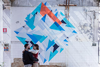
HARU on stuck design;
HARU stuck-on design; is a stickable and peelable space decoration tape brand by Nitoms, Inc., created under the revolutionary concept to "stick colors." SPREAD is the comprehensive creative director for its products, VI, packaging, catalogs, web page, and others. HARU has been exhibiting at Milan Design Week every year since 2016. The image is from Milan Design Week 2019.
KobayashiAnother thing was, I wanted to create the environment rather than objects. The original design using rocks and driftwood would have been too representational and direct the visitors' focus to the act of observing objects. Thinking abstract work would expand our imagination, we expressed the streams, colors, and big waves using the fabric without changing the original concept. Instead of the creativity found in the observed objects, we wanted to achieve the creativities that awaken our visitors' abilities to be moved.
The paths at the Midtown Garden are busy with people, with different purposes. We see people strolling through the paths, on their way to and from work, eating lunch on the bench, or resting on the rocks. The garden has a sense of safety, a beautiful atmosphere of green, and the absence of symbolic distraction.
As frequent visitors who stroll through the garden, being there clears our mind every time. This land once served as the samurai residence, long before it housed the Defense Agency, before the Midtown Garden. It might have been more closed, but we can assume that the area had heavy traffic of people. We came up with the concept of "arteries and veins" to express the land where many different lives traveled at a different pace and the image it has of circulation created by big waves and flow. The pink, red, and orange represent the arteries and the blue the veins.

Abstractness means the affirmation of being alive
KobayashiWe were invited by the Singaporean Department of Education to be at the conference last year. Singapore has focused on strengthening education. They have begun to move away from the former "cramming" style of education and promote the cultivation of senses through art as an initiative to value diversity. We were there to hold the "How to Perceive and Output Abstract Expressions" workshop to create wall painting for school art teachers. The wall paintings they created had, for example, a building and people, and none of them reflected specific stories. When we gave them the pointer that abstract art creates whatever the story the perceiver's heart wants to perceive, their faces immediately lit up. The primary colors we use are abstract, and what can be perceived from them is something very rich. I feel paying attention to these things daily is important.
The same can be said about Japan. The art and design have progressed in Japan. Still, we are not that advanced in terms of how artistic concepts and design concepts are incorporated in everyday life. Comparing the taxi drivers in Italy and Japan, for example, the conversation with Italian drivers is much more original and delightful. They give their opinions on what they think of our artwork and critiques without hesitation. That is how it should be.
YamadaThey openly express their opinions and have the capacity to accept them. Whereas in Japan, there is an unspoken rule that we have to say the right thing, and any wrong remarks can get immediately refuted. Abstract ambiguity can save people from being attacked.
KobayashiThe society needs to accept the functionality as well as the abstractness, and the ambiguity can create richness. Abstractness becomes the affirmation of personalities and being alive. I say, "That is how it should be."
The design originated in colors
KobayashiMy partner and I don't particularly have assigned roles, but she comes up with ideas and does research, whereas I complete the work. As a married couple, we continuously spend together and always discuss anything that interests us.
YamadaHe is from Niigata, and I grew up in and around Tokyo. We grew up in very different environments. What we studied is also different; he studied graphic designs and I environmental designs. When we talk, our ideas have different backgrounds, and it feels like conversations between two slightly different brains. Our design process begins with discussions. We brainstorm and verbalize our ideas, and they are indeed an essential process for us.
KobayashiWithout a solid concept, we cannot visualize anything.
YamadaOur very first work, Life Stripe, from fifteen years ago has been the base of our creativity. The work representing activities throughout people's day using colors gave us a sense of accomplishment that we could successfully communicate the scenes behind the colors at exhibitions in Japan and overseas. Initially, people questioned the purpose of the work. In Japan, people more commonly suggested that we apply our work to develop an application or asked what fabric was used. In Europe, no one, on the contrary, mentioned anything along the same line. People came to the exhibition to analyze the work in their own ways. One of the visitors, for example, said, "I love the energy of this red," with passion. Another visitor returned to the exhibition the next day and commented, "This color was very captivating yesterday, but I'm not feeling it today." A lot of visitors talked about themselves; some spoke about their families while others described their memories of the war. One person even got overwhelmed and broke down in tears. "I don't know this person, but I feel like I know them," others said.
KobayashiThis project has no clients. This will serve as a clear reflection of our trial-and-errors in the society.
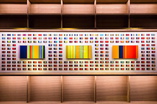
Life Stripe
Life Strip expresses an individual's activity throughout the day using 21 colors along a 24-hour axis. Since its creation in 2004, SPREAD has displayed the artwork and conducted researches in Milan, Basel, Singapore, Tokyo, and other domestic and international destinations.
Colors enable traveling between the past and future
YamadaWe once held a workshop to create Life Stripe with the Japanese-major students at the University of Milan. They picked a day and created their Life Stripe. Next, they interviewed an unspecified individual and created Life Stripe of that person. When students initiate in the action of interviewing others, it develops into a relationship between that student and society. One female student interviewed her father. With every little detail of the morning through the night, he picked and remembered about one particular day from twenty-one years ago, the day she was born. She learned and shared a new episode of the day with her father. That story was moving.
KobayashiDuring the research in Ibaraki in 2016, a participant shared the day of his grandmother from a day before she passed away in 2000. Although the day was uneventful as she spent most of her day sleeping, he recollected his memory of the day she rested in peace. He also imagined the emotions of his future grandchildren on the day he passes away. The mind traveled back and forth the time.
YamadaAlthough each artwork represents merely one pattern of an individual's day, it is capable of reviving or creating the stories of that person's past or future. Or, it can be a family member or someone else's past or future. Life Stripe's potency is producing a situation to bring out creativity by making the activities into abstract work.
KobayashiWe have collected roughly 150,000 days worth of data within Japan. We began collecting data from Italy, Switzerland, China, and other countries, and we started noticing the pattern that a different geographic area means a different activity pattern. On the parallel, we commenced another research on immigration.
YamadaIn response to our simple question to tell us about a random day, Japanese participants showed a stronger tendency to talk about a workday. To the same question, Italian participants spoke about a day they went on a date. Pink representing the time spent on a date, the sight of artwork with a higher percentage of pink stripes displayed side by side, one after another, simply boosted our mood. Japanese participants were inclined to hide about going on a date or use alternative activities, such as going to the movie. Italians said they find it very cryptic.
Competition of the senses to "mix-plate"
KobayashiIf I am to liken Roppongi to colors, I have to say they are black, neon pink, and neon green.
YamadaGreen came to my mind, too, but that green is relatively bright green. Nearly forty years of the initiative to redevelop Roppongi is supported by a solid afforestation plan. Despite the common perception that the city has an image of grayish buildings, Roppongi is greener than we think.
KobayashiWe often receive inquiries from overseas about working at our office as an intern. Some of the inquiries come from students in Switzerland. We wonder to ourselves why they want to come all the way to Japan from the land of typography. They say that the way the tradition and the busyness of Akihabara, for example, jumbled together is fascinating to them. We also have an intern from China who surprisingly idolizes Japanese pop artists and the designer, Katsumi Asaba
YamadaThey are like a day and a night! People from overseas find the contrasts, like the one between Kabukicho and Kabukiza, very amusing.
KobayashiThey see those things as equals, and that concept is normal. However, Japanese people are predisposed to think that ideas like "design village" and "idol village" are incompatible, and they are separated by a wall. We need to be more flexible in thinking, in my opinion. The wall doesn't have to be torn down, and we shouldn't force two separate worlds to collaborate, either. What I want is the societal milieu that wholly accepts the incompatibility. I want people to know eating natto with western breakfast items at a buffet is totally acceptable.
YamadaIt might feel unconventional, but combinations like that often turn out delightfully.
KobayashiIt would be interesting to see what people choose, to let them compete on their senses to "mix-plate." The competitors may not be familiar with what each food has in common. Adding a critic to the scene would make it more interesting.
YamadaWhile planning a new event is good, continuing events, especially the ones like "Design Touch," is vital. When we go after a new concept, sometimes it just ends up as a short-lived concept. But I know when we are persistent with the same concept, it ingrains in people. The first-time audience may not understand the scenes behind the colors of "Life Stripe." Yet, they will make discoveries each time they come back to the exhibition. Ultimately, it can signify the cultivation of the audience.
KobayashiWhen we listen to the song we loved in our teens after five or ten years, we learn something new about the song. The better the song, the more things we discover. That is what we are aiming for in terms of our creative work. We don't want the audiences to experience our work just once, but ideally, they find something new when their situations change because they mature or their circumstances change. With this type of perspective from the audiences, there would not be any need to create something new one after another. Even a pebble on the ground could bring amusement to people.
Editor's thoughts:
SPREAD is formed by the two individuals who graduated together, work as partners, and are united by matrimony. There have to be years of a prologue to the story of how they became captivated by the colors, after being struck by the beauty of contrasts in South Africa fifteen years ago. The interview was based on their assiduous work. It was an animating experience as if I could envision the view of the past and the future. Mr. Kobayashi's saying, "There is no such thing as a bad color," left a special impression on me. He is absolutely right. Colors sometimes are more eloquent than words. (text_ikuko hyodo)
RANKING
ALL
CATEGORY


